Branding for Jia Jia Fu Restoran
Jia Jia Fu Restoran is a F&B outlet in Malaysia, Johor Bahru, selling local food like laksa, mee hoon kueh, etc. The new brand is a family-owed business and had limited budget to work with, including doing up the interior of the restaurant, so I had to think of a branding concept that is strong, yet able to fulfil with a small budget.
The logo
'家' is shaped like a roof with '口' highlighted, conveying the meaning of '家家有口福‘ - delightful culinary treats for every household. The logo was shaped with three circles, meaning it is a place for not just friends, but families (more than 2) to gather. '三' in Chinese culture has the meaning of '升', meaning business prosperity.
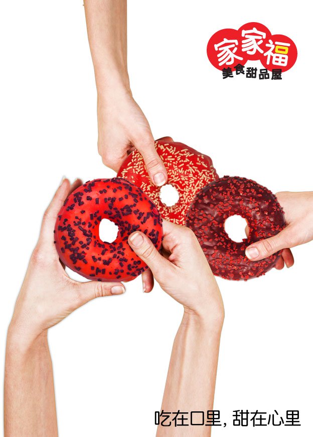
Launch Poster
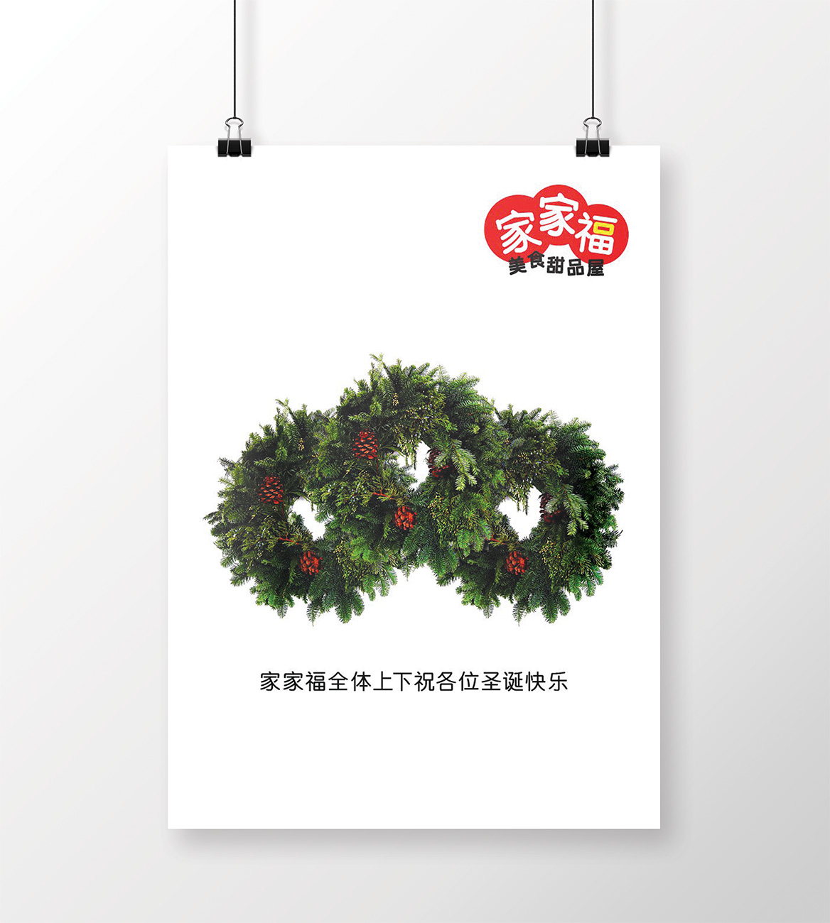
The restaurant was opened on 23rd Dec 2010, two days shy of Christmas, so I did up a poster for the launch. This was thought as part of the big idea when I conceptualised for the entire brand.
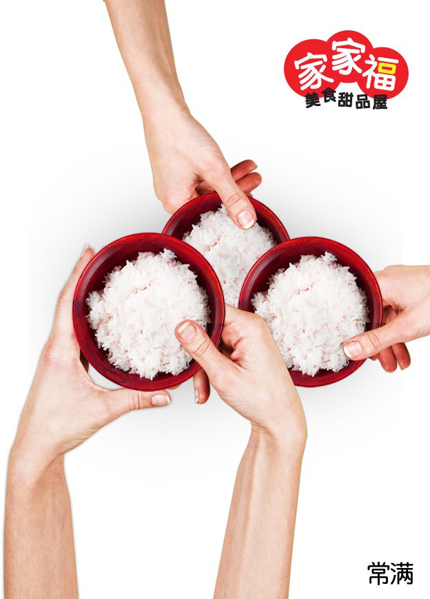
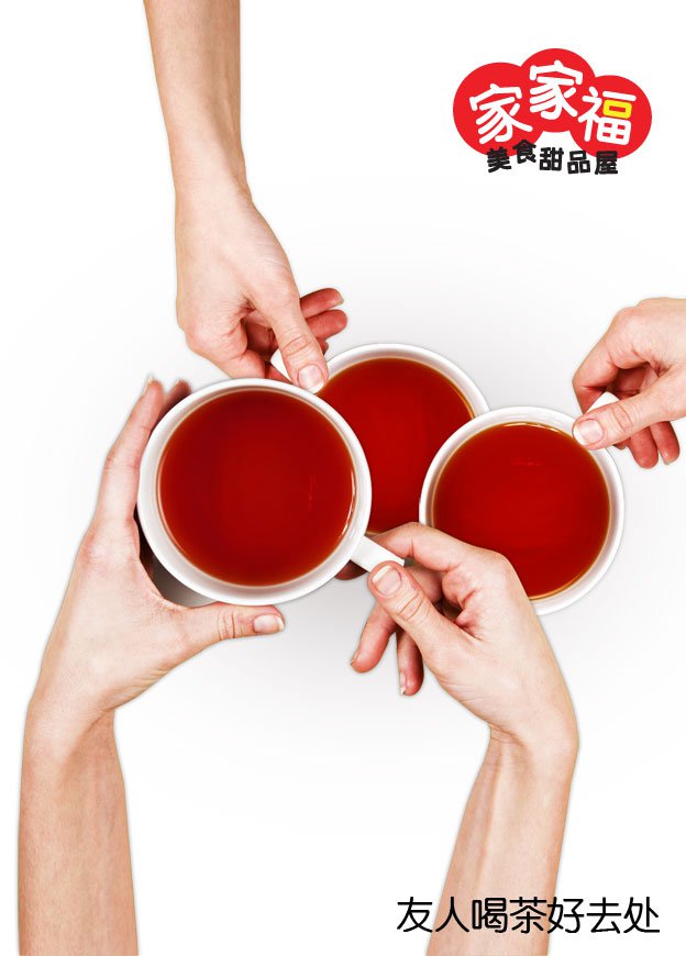
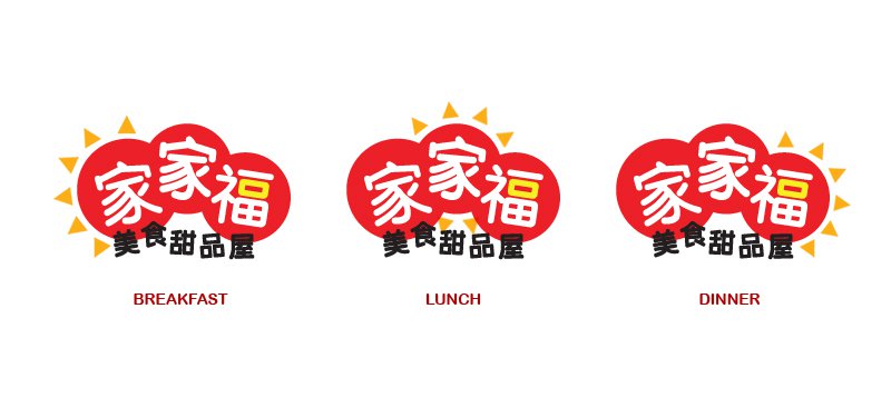
Logo Concept translates to respective cover designs for Food, Drinks and Dessert Menus
Breakfast, Lunch and Dinner logos
It wasn't until I worked with a F&B business owner that I know the significance of catering for breakfast, lunch and dinner crowds. As rental is all-day round, there will be special promotions for time slots in-between peak dining hours and individual menus are designed for breakfast, lunch and dinner. With this thought in mind, when I conceptualised the brand logo, I knew I could think ahead of how the logo can be played to communicate breakfast, lunch and dinner menus!
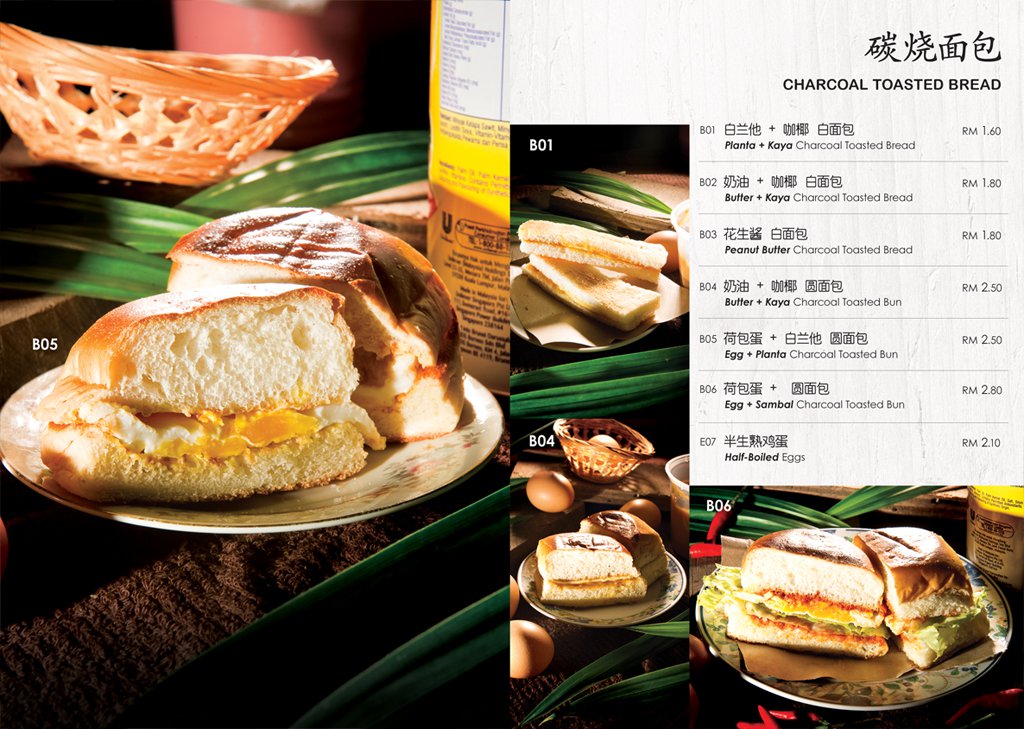
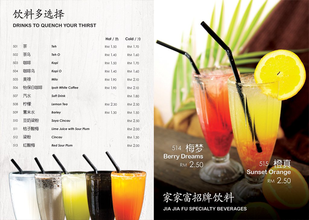
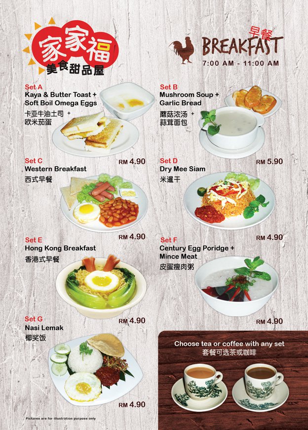
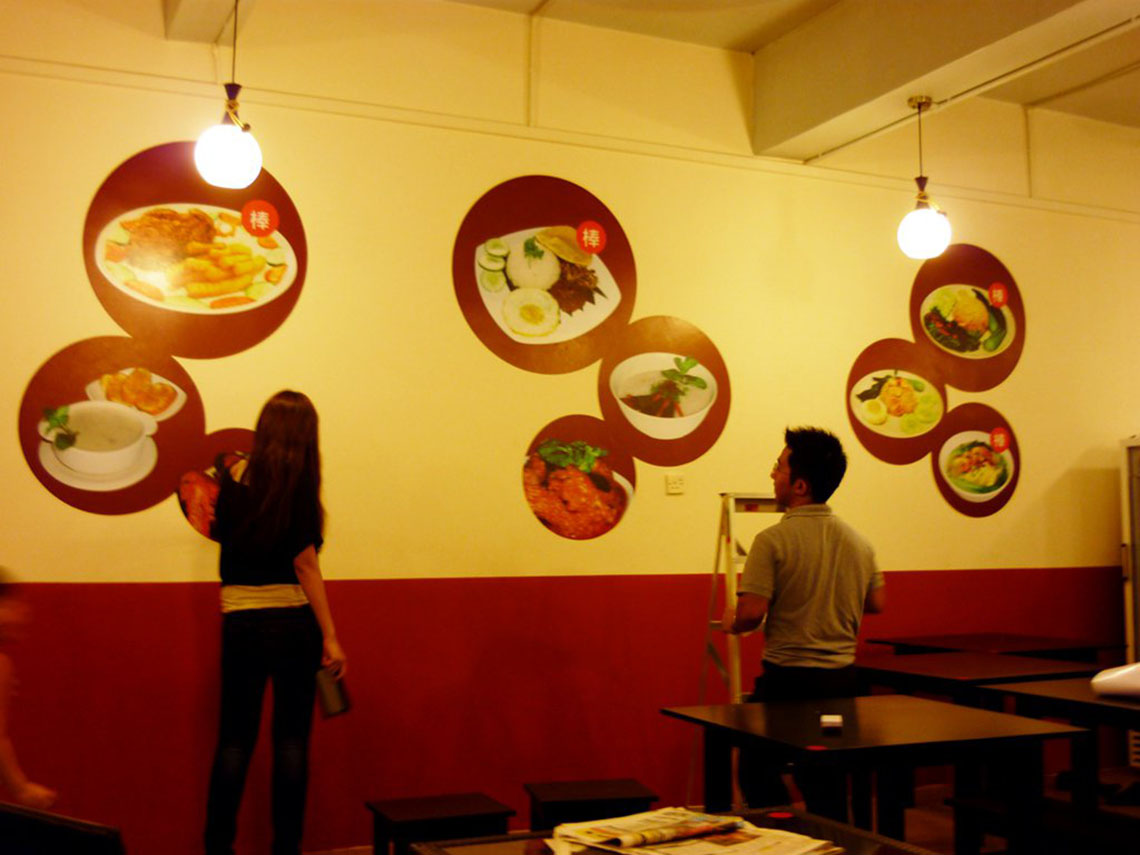
Breakfast Menu
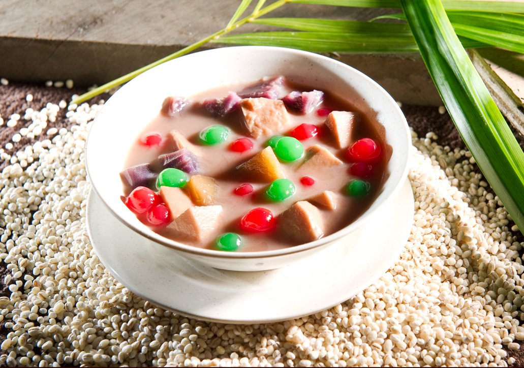
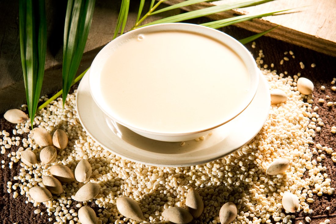
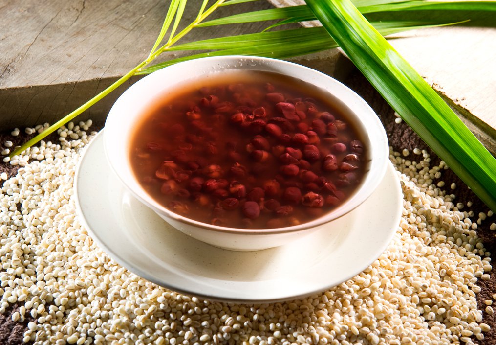
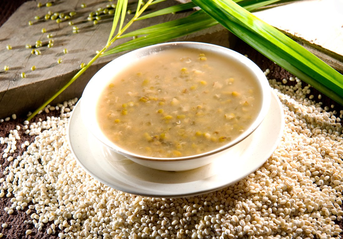
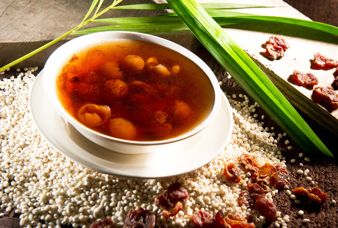
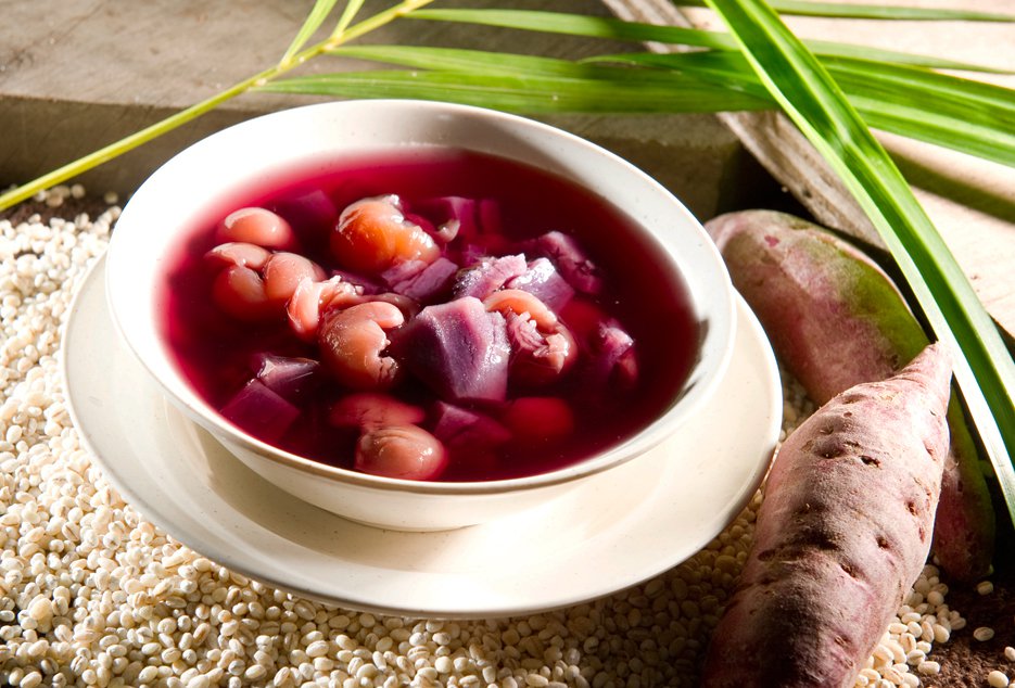
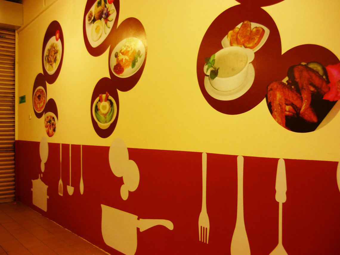
Food Styling
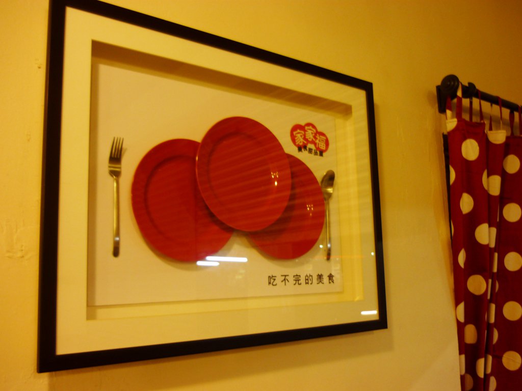
Restaurant Decor
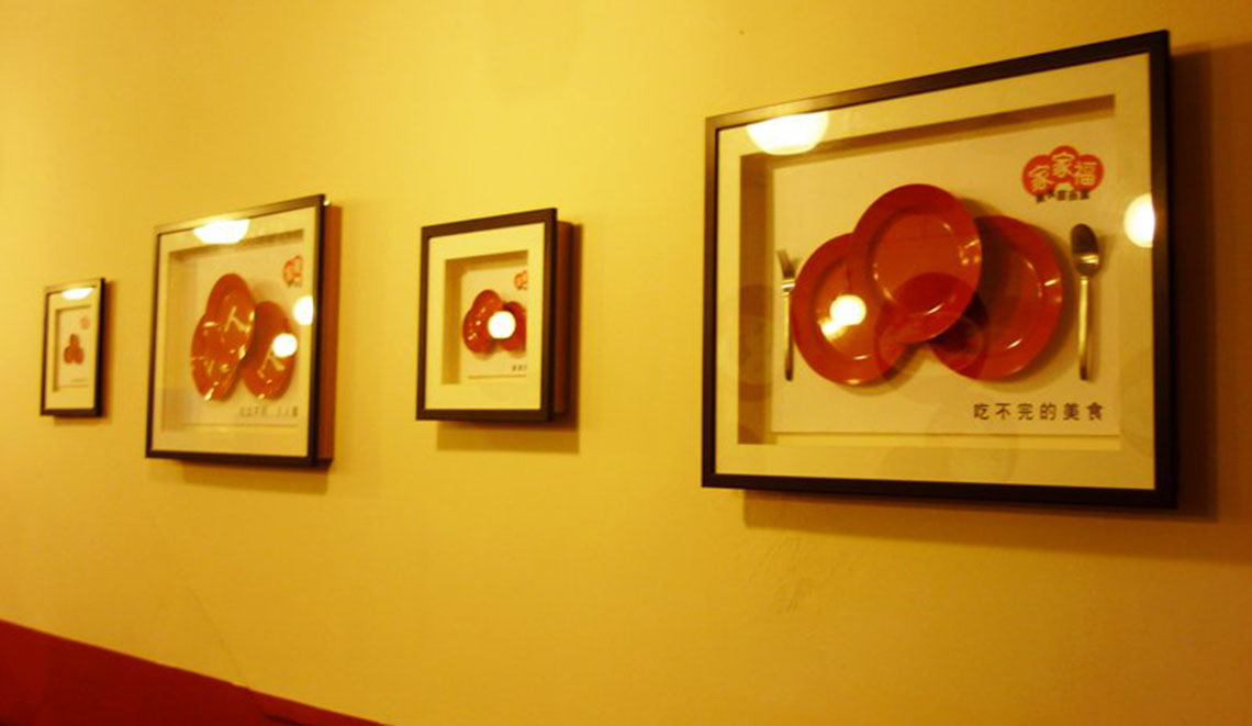
As the project has limited budget for decor, I found myself touring really nondescript hardware shops in JB for inspiration, soaking in the culture and how the locals live. During one of such trips, I noticed the red plates that are synonymous with how local dishes are bring served at hawker stalls over there (heck, even some of our very own wanton mee in Singapore are served in such plates too!). I find the food offering very relatable and thought of a way to dress up the restaurant at a budget, yet reflect very deep meaning and cleverness.
01.
I bought a set of fork and spoon from IKEA and stack three red plates in the middle of them, conveying the meaning of many kinds of offerings for every customer to choose from. I also framed up the concept, befitting the look of a traditional chinese restaurant, yet chic and classy.
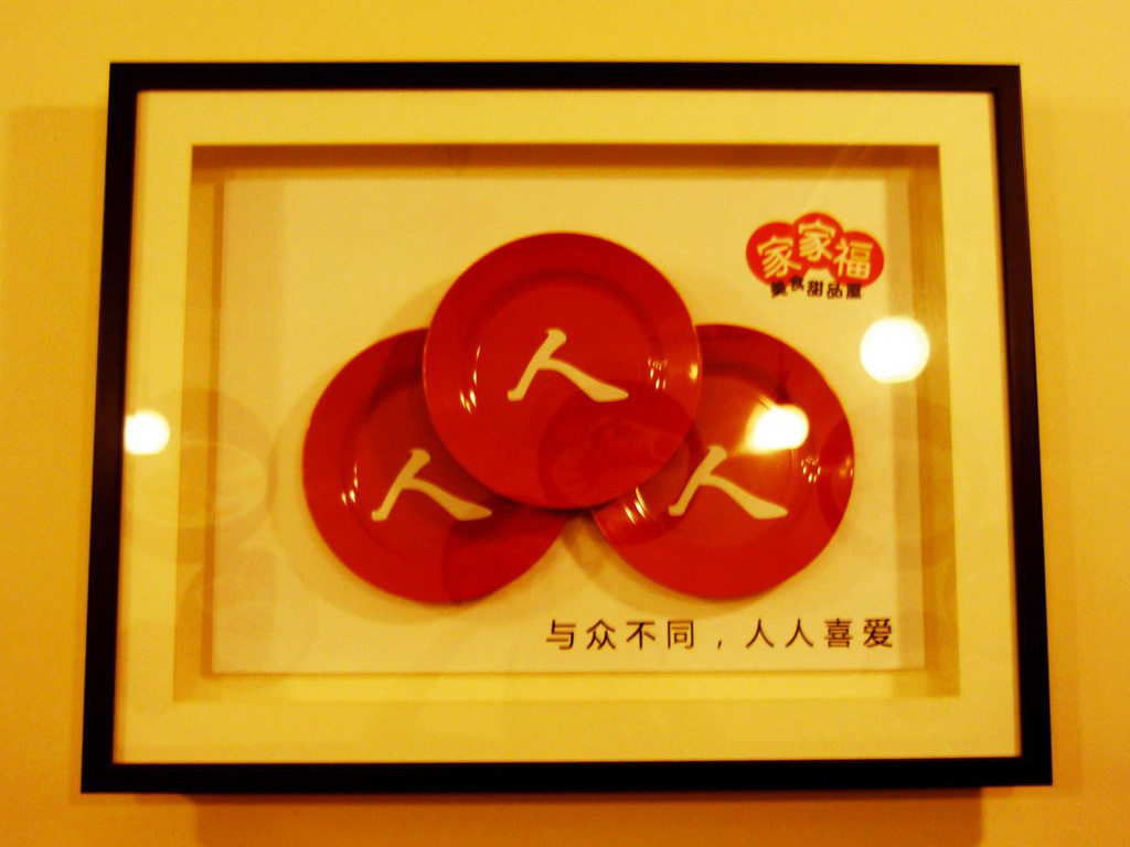
02.
I also thought about it and realised the character for '众' (crowd in Chinese) is actually made up of individuals '人' being grouped together. Thus, I came up with a clever concept for this word play. I love crisp, precise copywriting that reflects rich meaning.
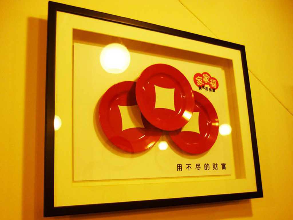
03.
I spray painted the middle of each red plate with stencils to form the visual metaphors for ancient Chinese coins to convey the meaning of abundance of wealth. There is a series of these (conceptual) installations displayed along the wall of the restaurant, including one with saucers reflecting '津津有味'.
The Menu
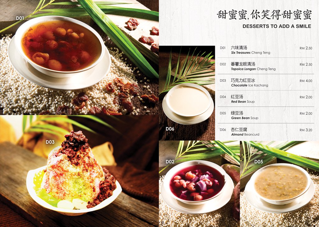
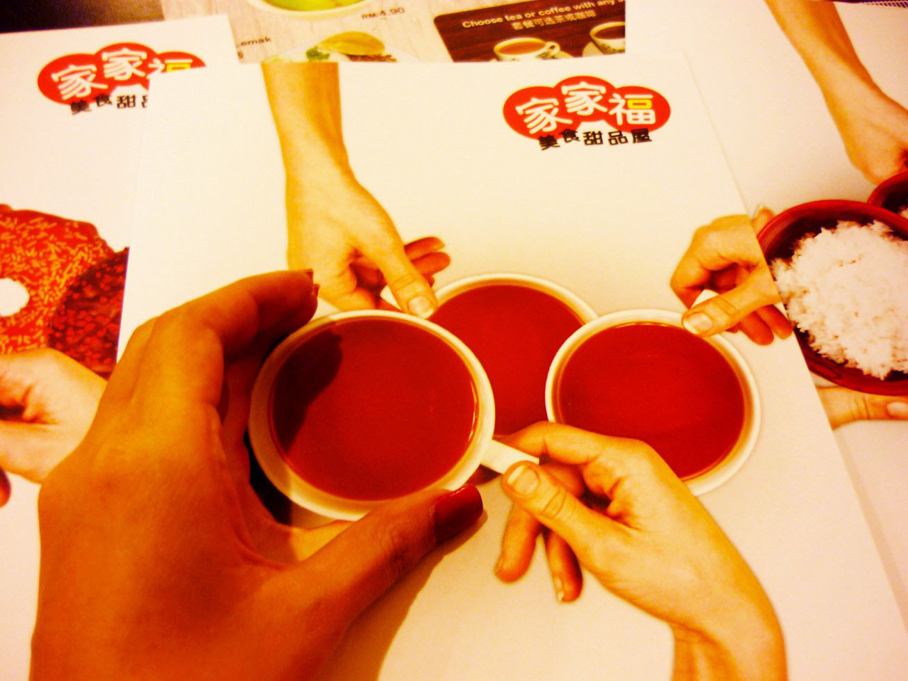
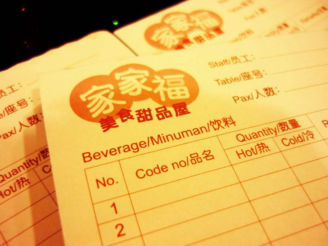
The brand was renamed as '家家富‘ after a year in operations but the brand concept remained the same. I did the styling of food and design of their menus.