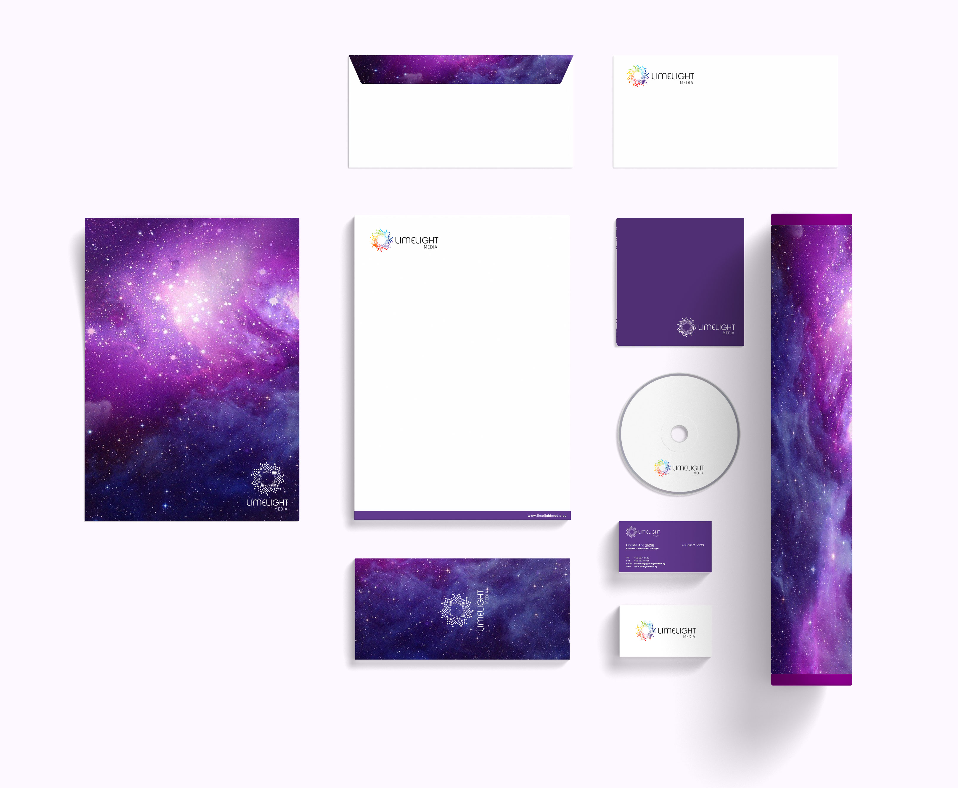
Branding for Limelight Media
This is a project that really showcased my ability to ideate and conceptualise and implement the big idea behind a company's logo design which will then span across respective branding communications including print, and even motion graphics.
When I was recommended to the founder of Limelight Media to do up the branding for his company, he set me up for a challenge (and I love a good challenge in the mind) - if I can come up with a good concept for his new company's logo which will in turn, answer to how the opening animation for this logo will be, he would pay me in full, no questions asked.
And "By the way", he said, "The chinese name of the brand is '聚星', please consider that in your concept." (what a wonderful and meaningful Chinese name for the brand!)
This new company will be involved in movie investment and they would need an opening logo animation that will play in theatres before the actual movie screens, much like what we are accustomed to seeing from the likes of 20th Century Fox, Warner Brothers, Universal Pictures, etc. The concept behind the company's logo will have to be precise but strong, as any second added to a logo animation is production cost added, plus an opening sequence would last no more than mere seconds.
The challenge here is how do we come up with a strong logo concept, relevant to the brand, yet effectively carry the idea across to an opening logo animation that should not last more than a few seconds?
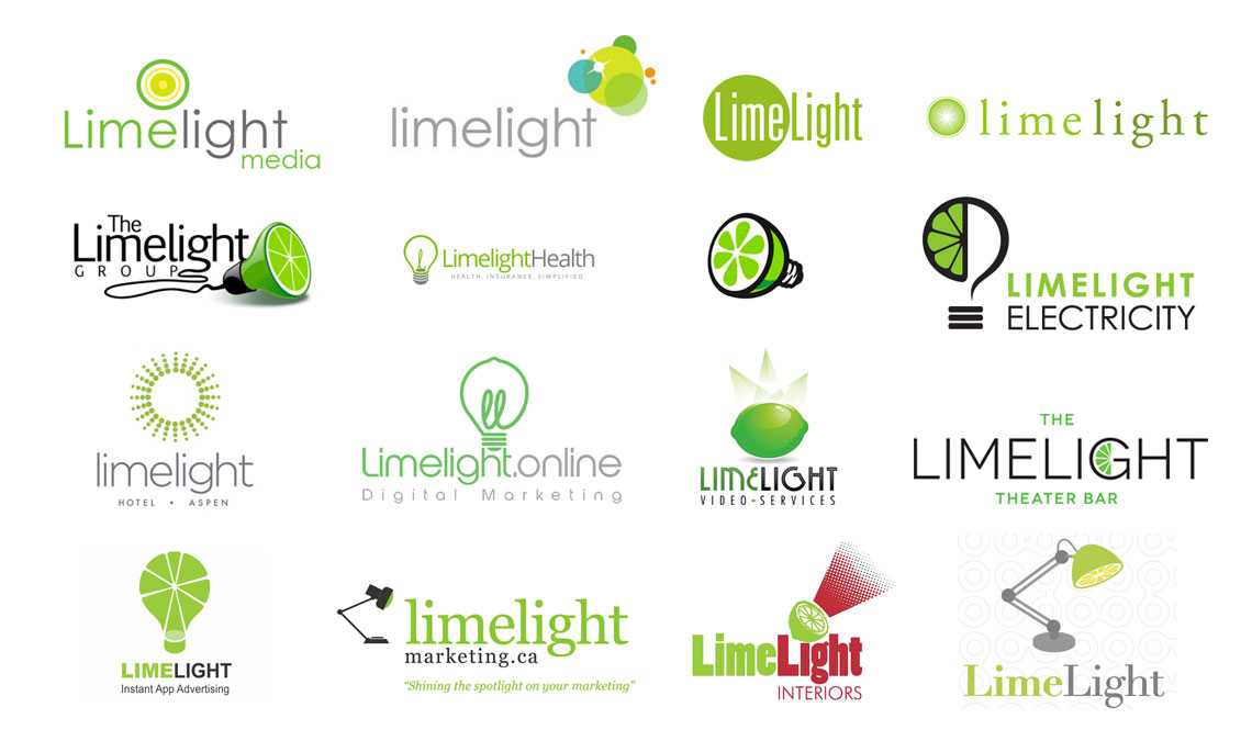
Before I started working on the project, I had guessed that the norm interpretation of such a brand name would see designers often combining the shapes of a lime and a lamp (or any light-related visual metaphors), and a quick search on Google would confirm this thought:
I wanted to inject maximum meaning to a brand's logo and felt that while '聚星' (gathering of stars in Chinese) is the brand's name, it actually also sounds like '巨星' superstars, celebrities) when we play a pun on it. I felt that it would be great if my concept can combine these two meanings and put a visual representation that signifies "gathering of superstars". I knew that the concept would be inspired from astrology:
Having understood this new brand's unique offering, I knew that the general interpretation of combining visual metaphors of a lime and light does not give justice to the brand. I wanted the general shape of the logo to be inspired from a circle. Why circle?
- It is inspired from the shape of a huge planet, 巨星
- It represents stars coming together to entertain the world
- It signifies being under the spotlight

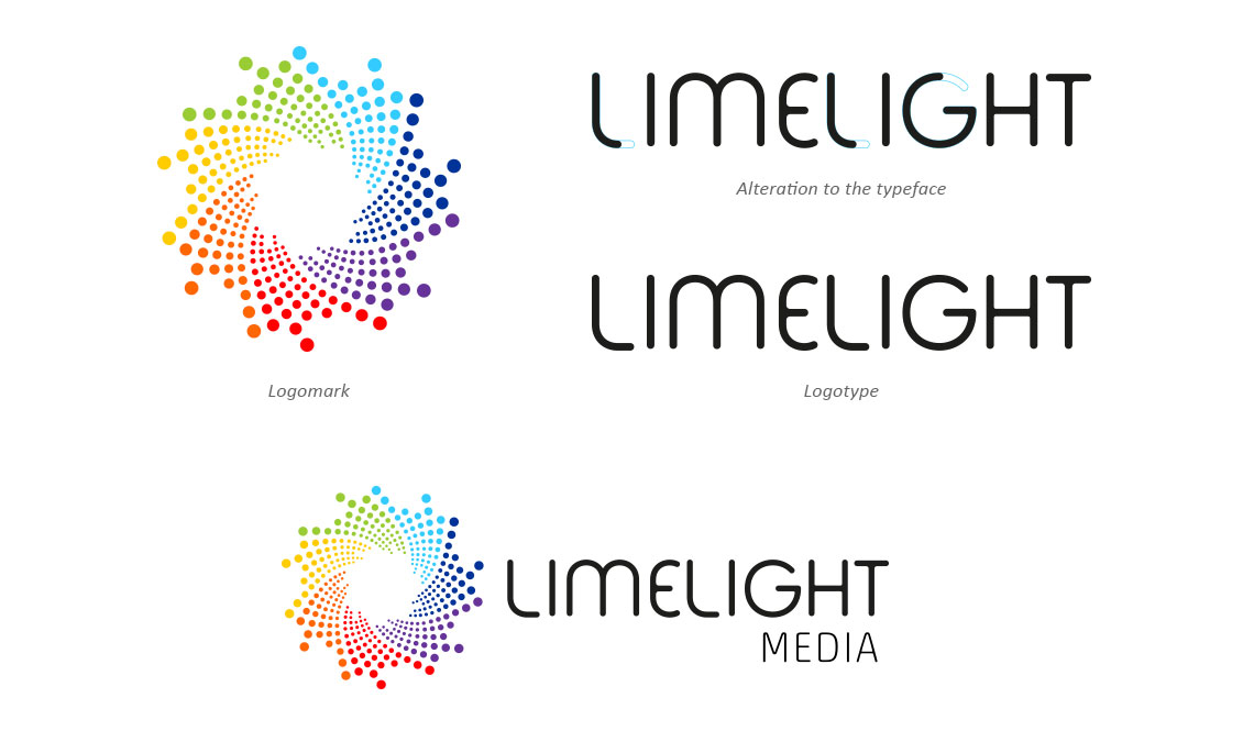
- The swirling motion in the logo symbolises the gathering of stars (聚星) to entertain the masses. The entire logo is the shape of a superstar (巨星).
- I wanted to convey the meaning of stars shining at their brightest under Limelight Media’s productions. So when is light the brghtest? (little bit of science here) It is brightest when it is white and white is formed by the gathering of all 7 colours in the rainbow spectrum. These 7 colours also stand for being entertained ‘7 days per week’. There are exactly 365 circles in the logo to represent all-year-entertainment. The 365th “circle” is right in the middle, a starburst effect when planets (superstars) gather and collide.
- The typeface Fabada was chosen as it resemblances the structure of neon lights, representing the concept of being in the centre of attraction. The typeface for Limelight Media should not be too thin to represent a reputation company where huge funds are involved, nor should it be too thick or rigid as it takes creativity to entertain the masses. It has to be the right amount of weight yet look unconventional while maintaining a professional image.
- The logomark coincidentally also looks like a camera shutter (paparazzi), thus adding even more meaning to the gathering of ‘superstars’.
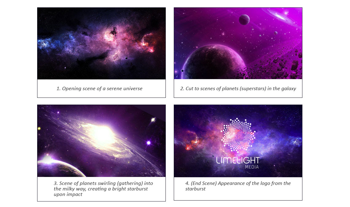
So how does this logo concept answer to the requirements in an opening logo sequence (animation)?
View storyboard below. Entire sequence should not be more than 10secs.
It is tough for me to sum up the depth of my thoughts with text, and I understand it can be tedious for others to follow through. So I put together a video to walk you through this while you sit back and enjoy.
