Logo Design for Tokyo Megane
When the brand owner for 'Tokyo Megane' came back to me for another project after the fruition of 'Kyoto Optics' (at Bedok Interchange), he mentioned that the meaning of 'Tokyo Megane' literally means 'Tokyo Spectacles' in Japanese. Likewise for his requirement in 'Kyoto Optics', the design of the logo must
- Contain the colours primary blue, yellow and red, inline with the flag colours of his faith, Sokai Gakkai International.
- Have the English, Chinese and Japanese names all at once
This is a tough nut to crack, wouldn't having the same name in three different languages be too much for a logo?
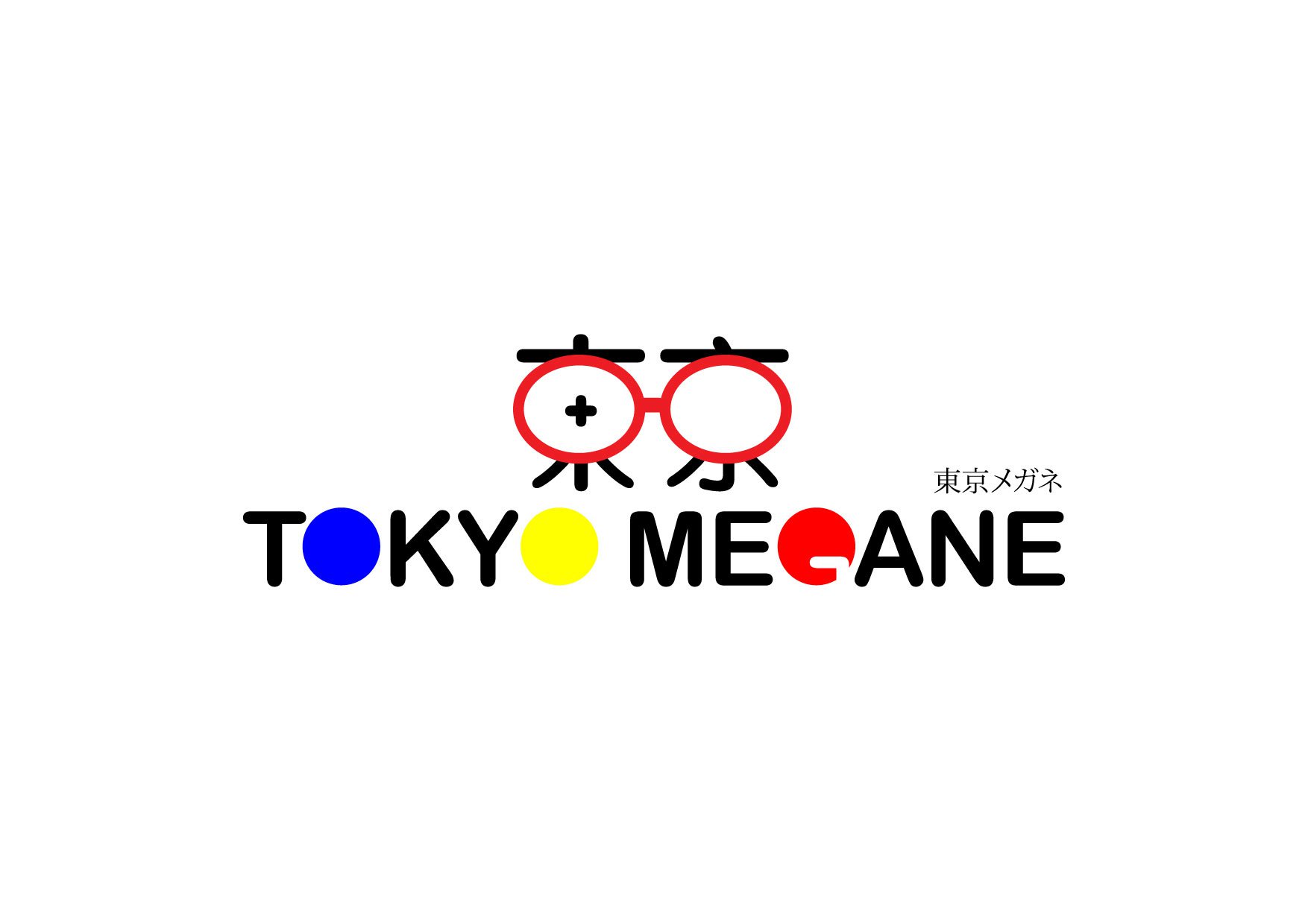
After some research, I realised that 'Tokyo' is actually written as '東京' in Japanese (kanji) and '东京' happens to be '東京' in traditional Chinese. By coming up with a design inspired from the words '東京', I could kill two birds with one stone and reduce the amount of graphic representations needed to answer the client's requirements. Plus, I could seamlessly design a pair of spectacles into the logo to literally mean, 'Tokyo Spectacles'. I would never want to do a cliche design for an optical shop, but this brand name (with my wish to reduce the graphic elements) truly calls for it.
One thing did remain very difficult. The logo looks great with just two colours. Designing the colours primary blue, yellow and red into it as per client's criteria seems forced:

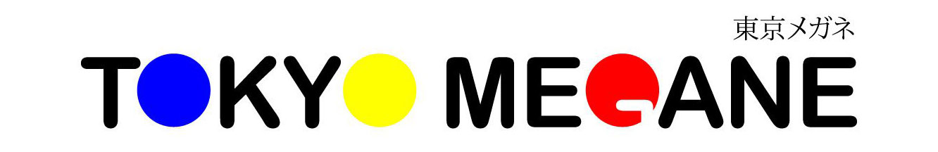
I thought real hard on how I could fulfil the brief without compromising on the quality of design. After some thoughts, I realised that there are actually 3 "circles" in 'Tokyo Megane'.
I had to imagine 'G' in negative space instead. This horizontal arrangement also looks exactly like the flag of Soka Gakkai International, much to the client's delight.
Tokyo Megane is opened at Heartland Mall, Pasir Ris White Sands & Harbourfront Centre