Stalford International Preschool Corporate Identity
When I was first handed this project, the person-in-charge who was a strong background and experience in the preschool industry, told me that the brand concept must have a way to communicate the values; Inspire, Inquire, Imagnine and Invent as the building blocks of their curriculum.
Find out how I approach this challenge and come out with an all-encompassing solution below.
You can also read up on the entire corporate identity by clicking the button on your right.
01.
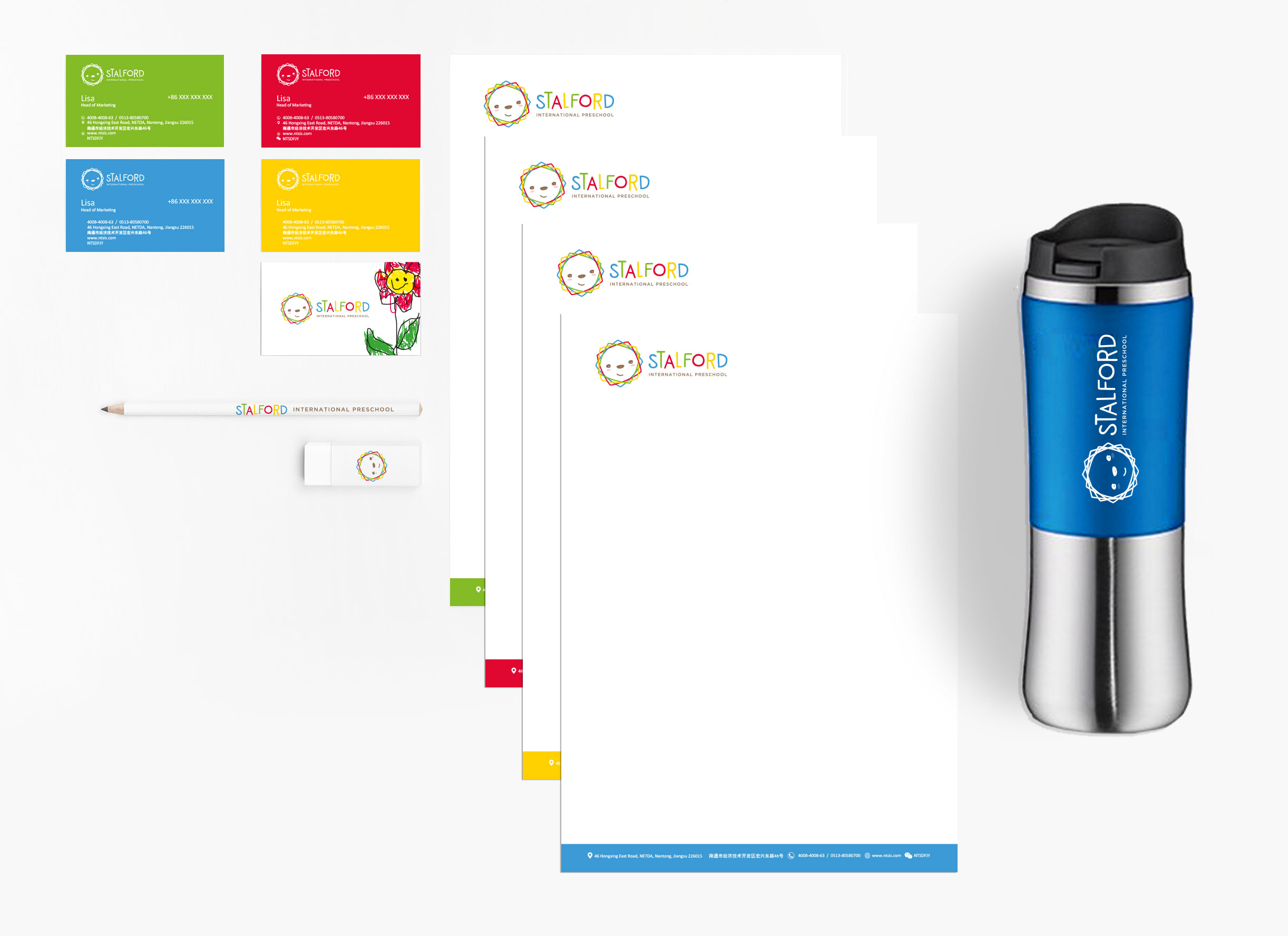
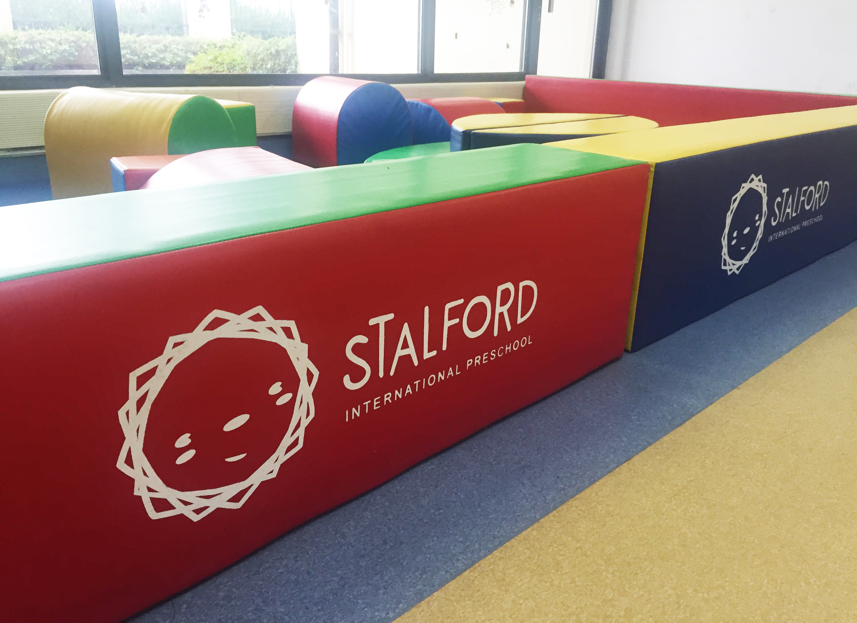
The logomark of Stalford International Preschool pays homage to Stalford’s roots as a Singapore brand and is represented by a lion. The abstract lion signifies the importance of raising bold and courageous children with values that will equip them to raise up to challenges in this complex and ever-changing world. Lion, being king of the jungle, also represents being upheld by universal values like honesty and integrity while being highly adaptable to the demands of this competitive world.
02.
The abstract logomark is also inspired by the shape of a blossoming flower as each child has something unique to offer to the world and we have to respect that each of them will have their own pace of learning and talent.
03.
The logomark is abstract as a child should not be taught to conform to the norm, but rather, be encouraged to fully express themselves and individuality so that we learn the beauty of seeing the world through their untainted eyes. Be ready to wander in wonder.
The logo is made of four overlapping blocks, each representing the respective value; Inspire, Inquire, Imagine and Invent. They overlap one another to represent a curriculum that encompasses all four values. The smiley face represents the importance of instilling the joy of learning as a foundation at an early age as this principle will accompany them throughout their lives.
Colours are an excellent way to express the unique personality of a brand.
- Fuschia red stands for being passionate in what we do, as well as cultivating the interests of children and maximise their potential.
- Calm blue stands for peace in conflict-resolving, a vital skill for children at this age as they are learning to vocalize what they want or need and raising younglings into loving individuals who know how to resolve conflicts through peaceful means and good communication creates a better world for future generations to live in.
- Youthful green stands for the vitality of the children.
- Passion yellow stands for being approachable.
- Earthly brown stands for cultivating individuals who are down-to-earth and have good values like respect for others, honesty, integrity and compassion, etc, deeply rooted in them.