Nantong Stalford International School Branding
This marks my first foray overseas: to brand up an international school in China.
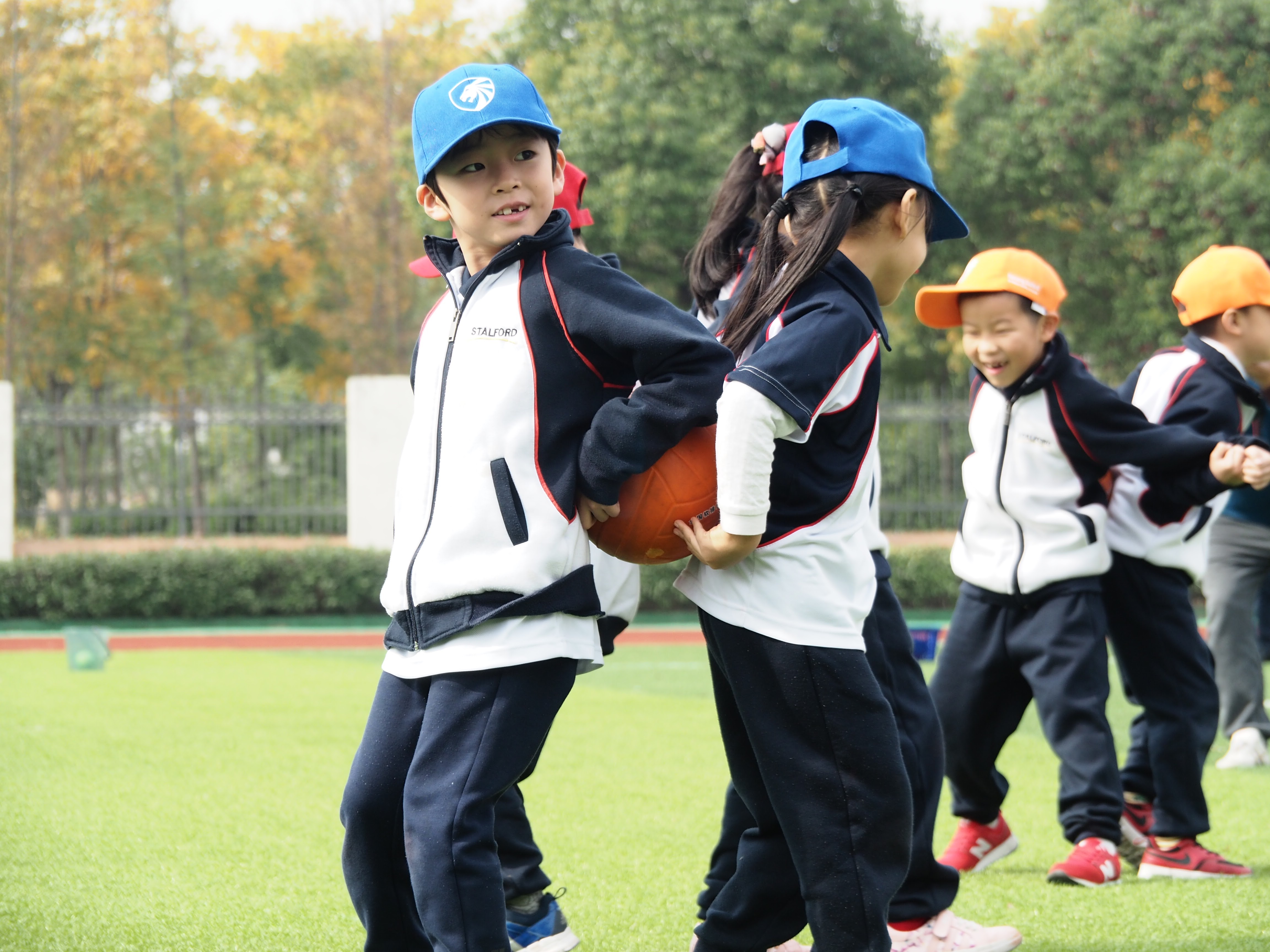
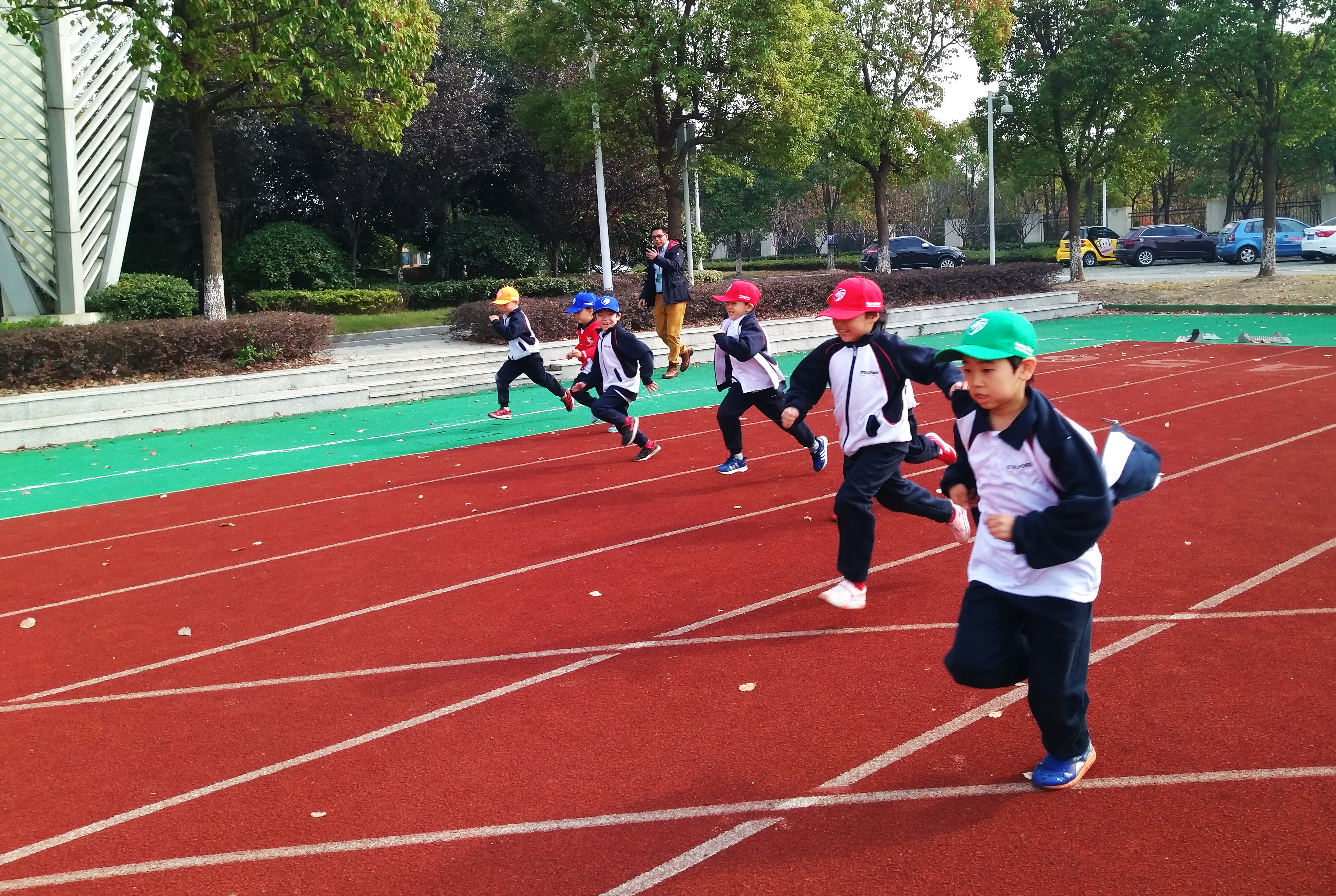
I have never imagined that one day my works would carry me overseas and it is such a joy to know that my work will be worn by students, generations to generations.
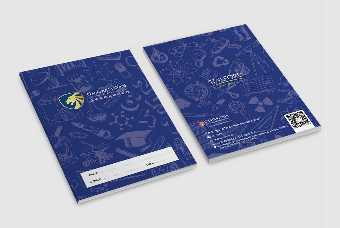
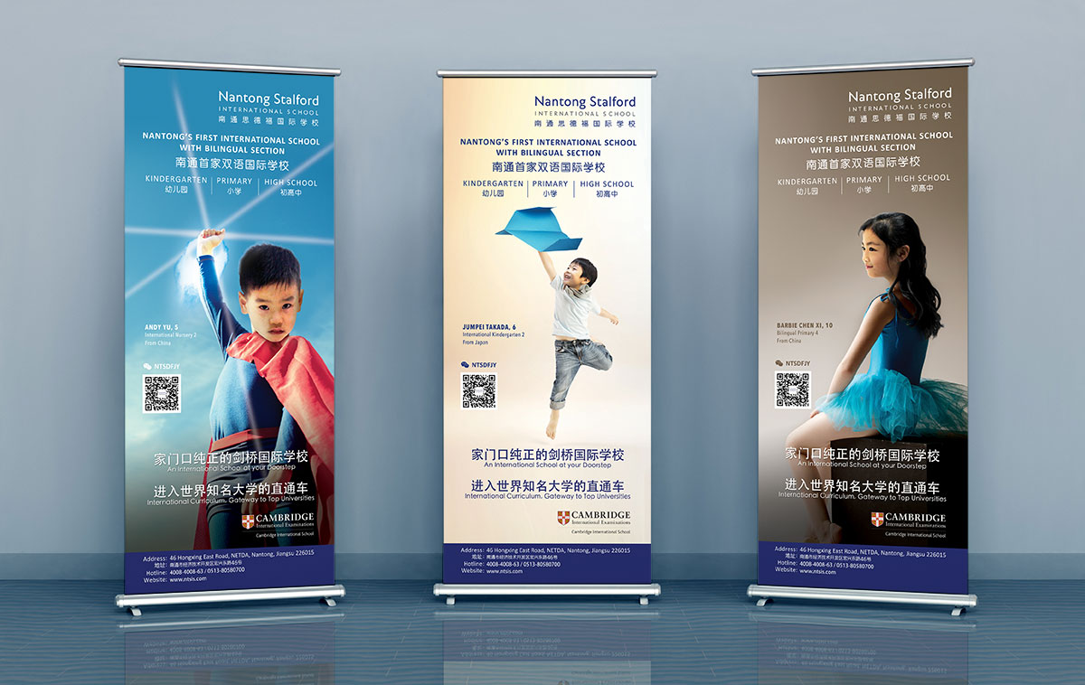
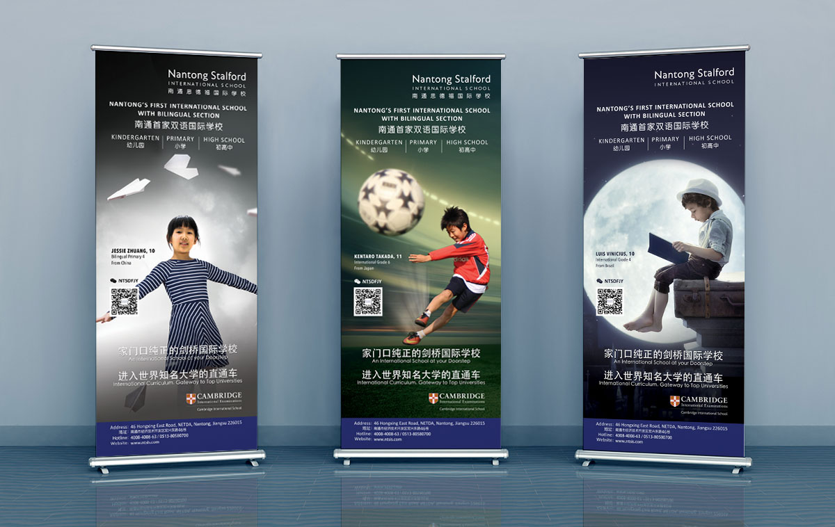
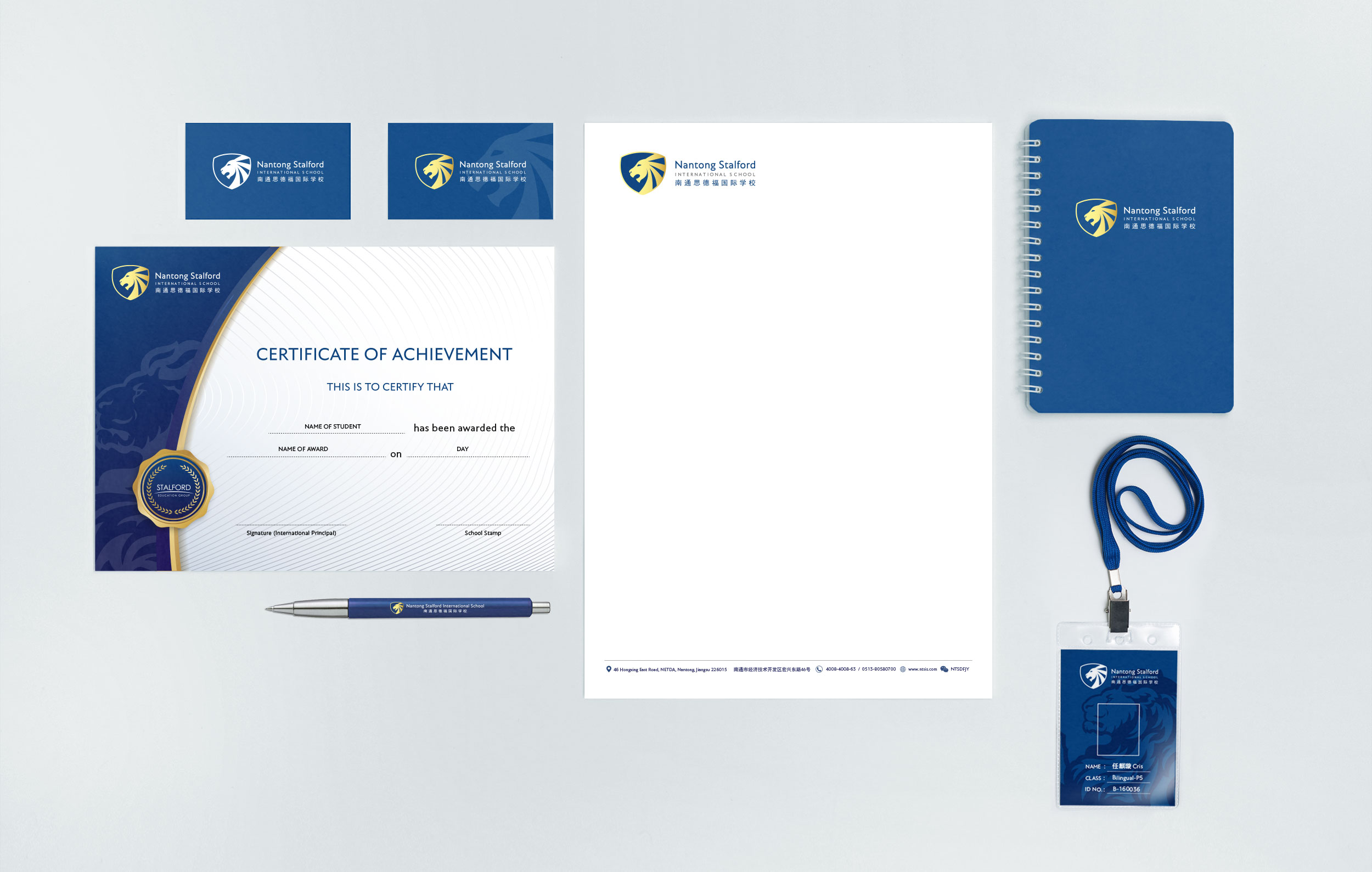
I was responsible for all aspects of the school's branding, designing students' exercise books, marketing banners and brochures, yearbook, etc.
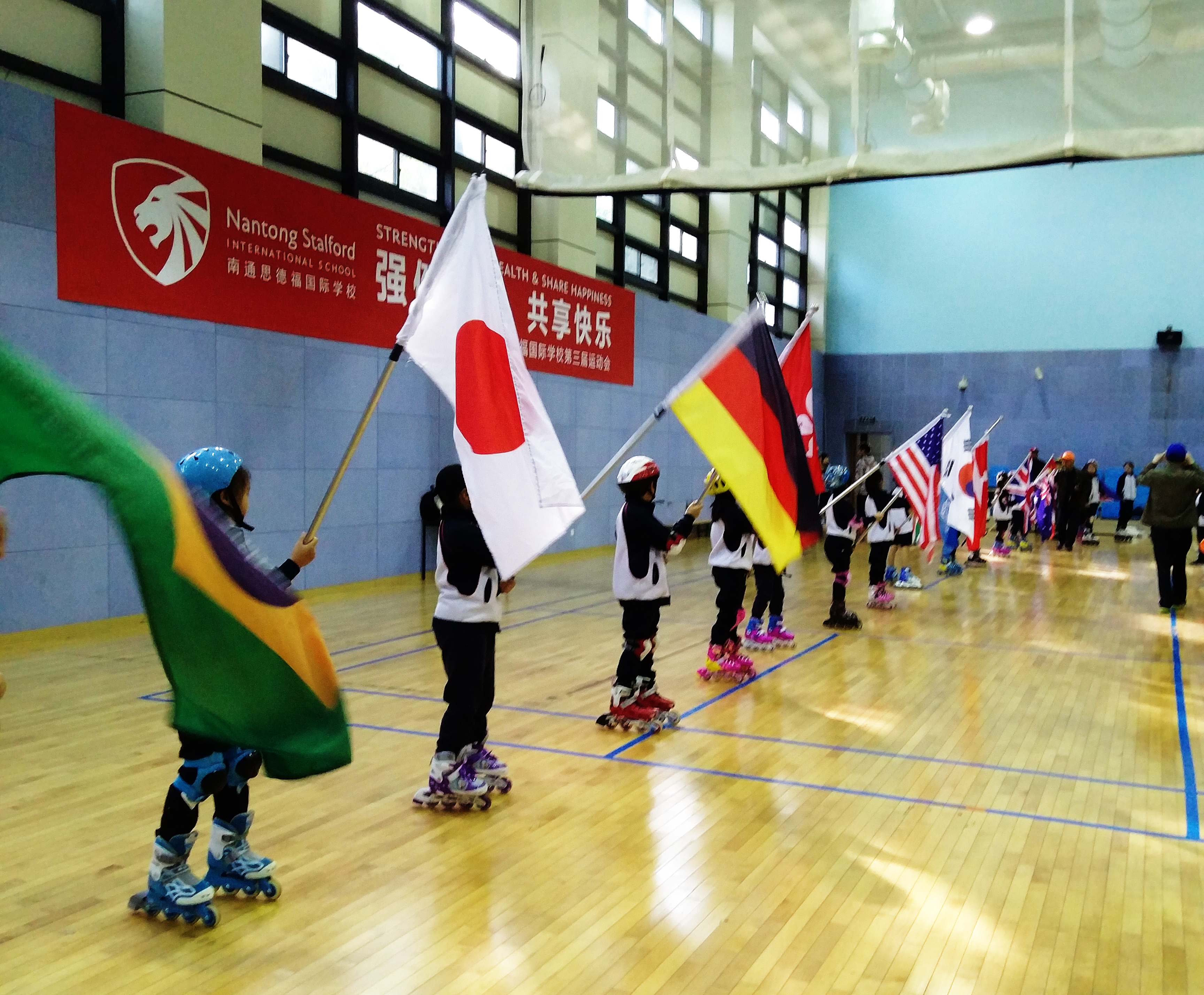
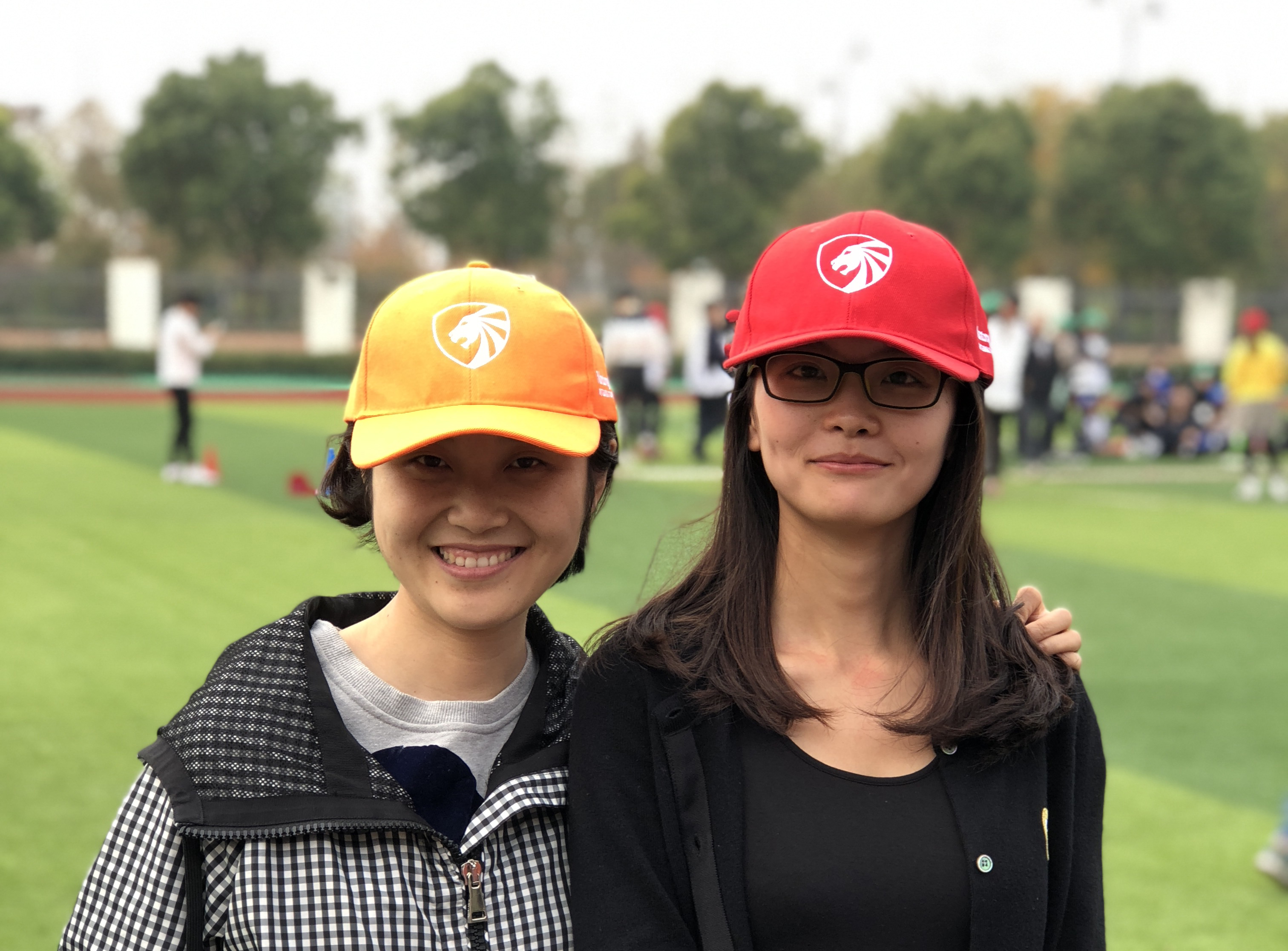
The logomark of NTSIS pays homage to being a Singapore brand and is represented by a lion. The majestic lion signifies the school’s commitment to developing bold and courageous students who are ready to take on challenges as they navigate the unpredictable currents and demands in this complex world. Lion, being king of the jungle, also represents being upheld by universal values like honesty and integrity while being highly adaptable in this ever-changing world. The mane of the lion is inspired from the wings of flight to represent soaring ambitions. The shape also looks like rays of light to represent being a beacon of hope, with each stroke representing diligence, resilience, compassion and perseverance respectively.
The shield in NTSIS's logo signifies a secure and loving environment as they provide students with a community of holistic learning in which they can strive for excellence, maximise their potential, and understand their personal and collective responsibilities.
The colours dark blue and gold are chosen to reflect professionlism and relability.
To sum it up, NTSIS is future ready.

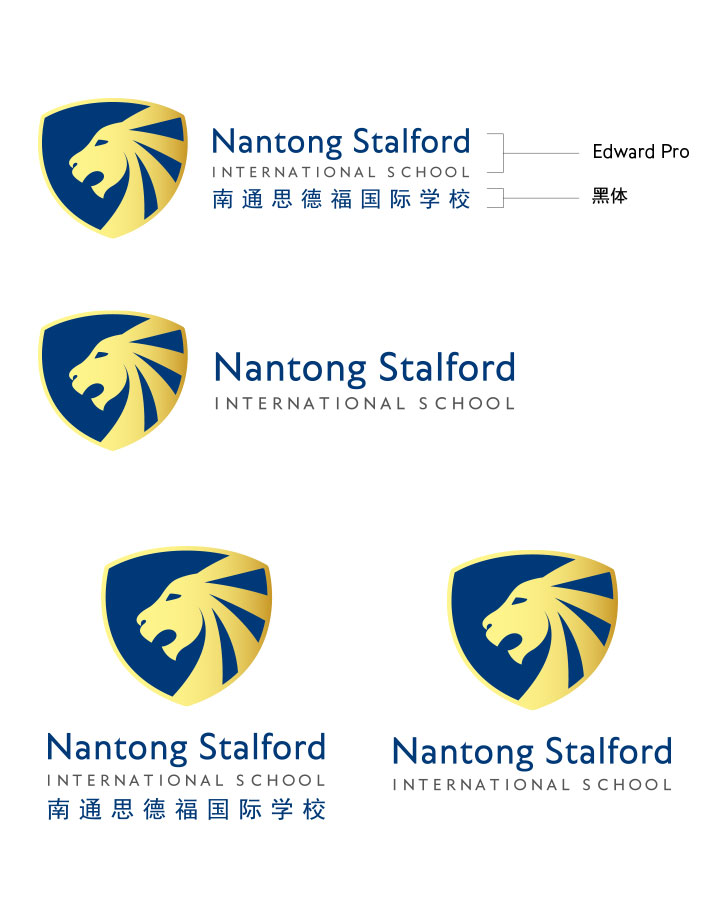
Variations of NTSIS logo
01
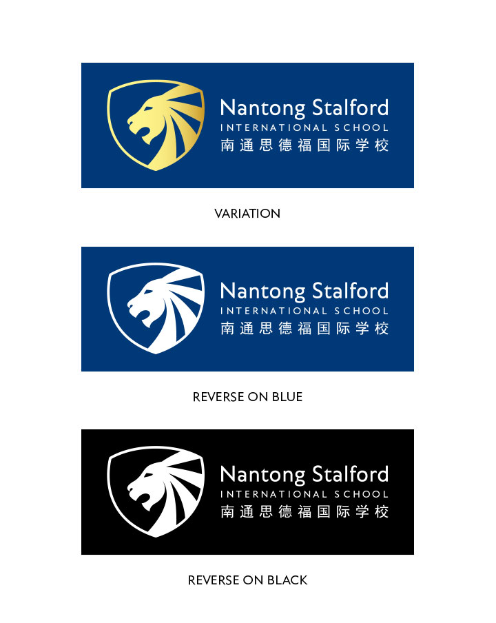
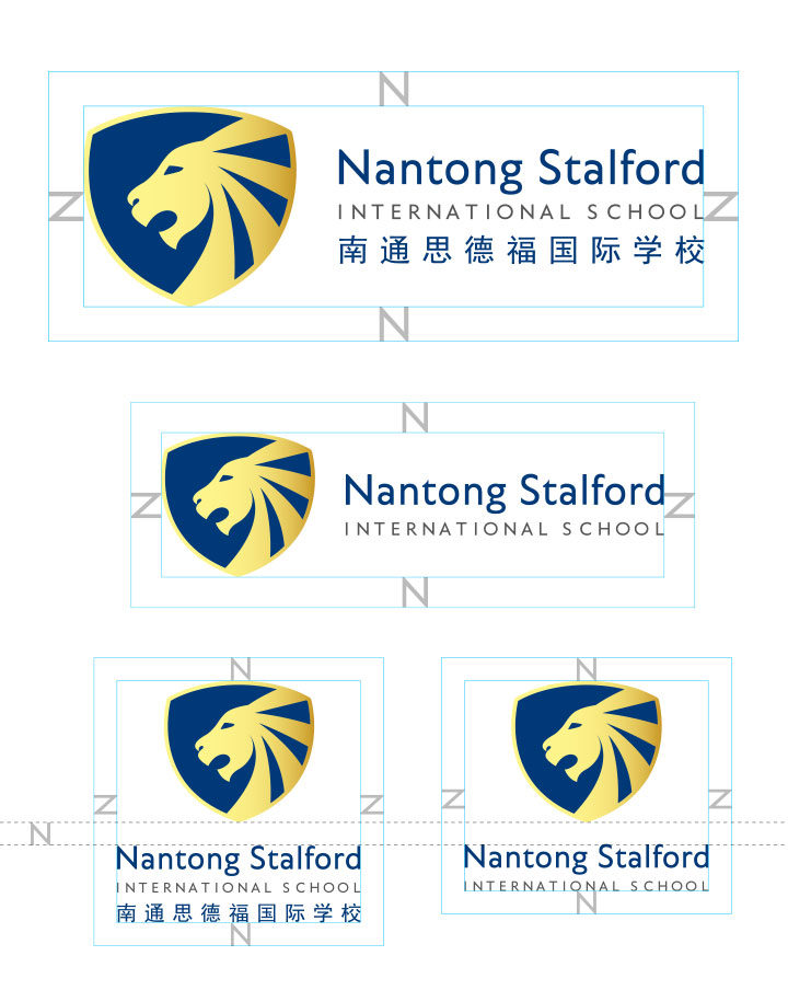
NTSIS logo in horizontal and vertical arrangements, with and without chinese text.
02
4C and 1C versions of NTSIS logo in horizontal arrangement.
03
Minimum clear space around logo
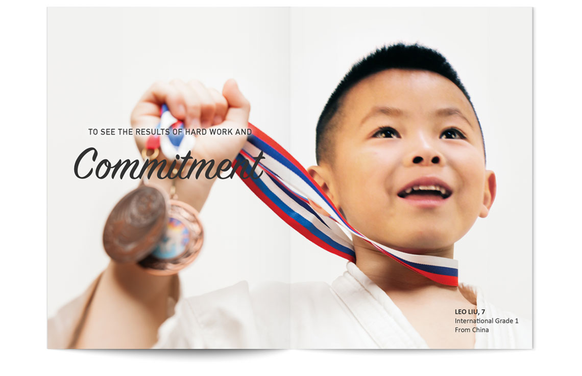
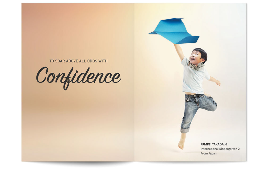
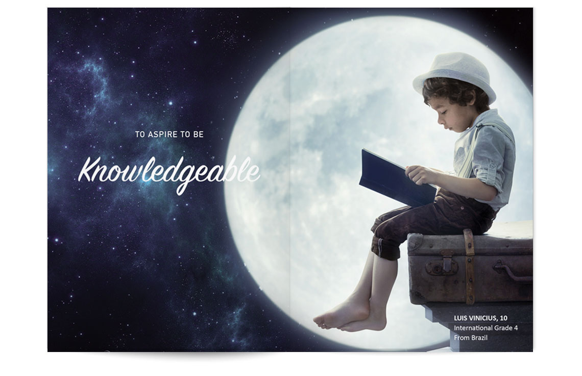
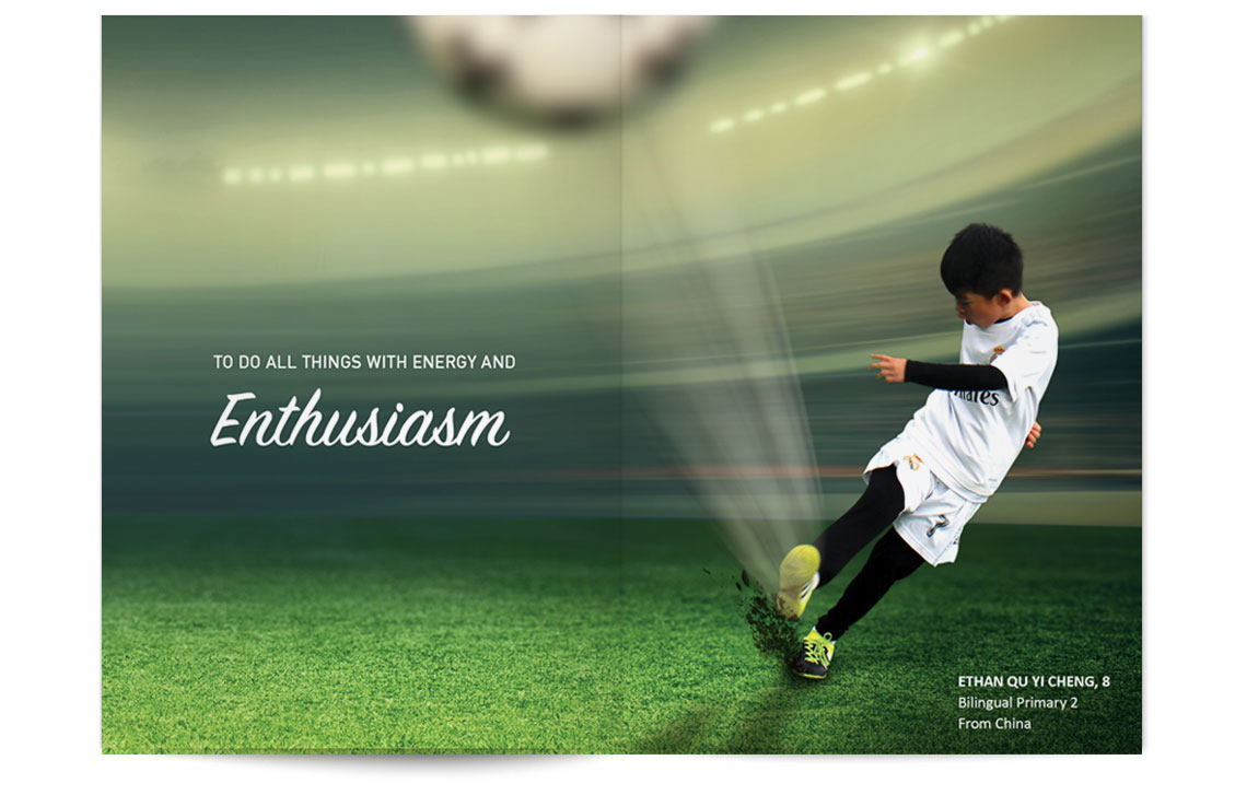
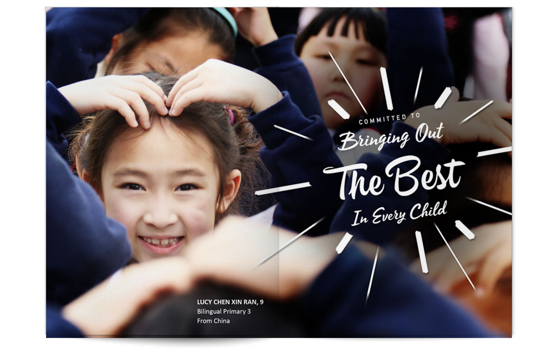
NTSIS Souvenir Book for Marketing Purpose
I am responsible for creative concept, art direction, photography and design. All models used are the school's very own students.
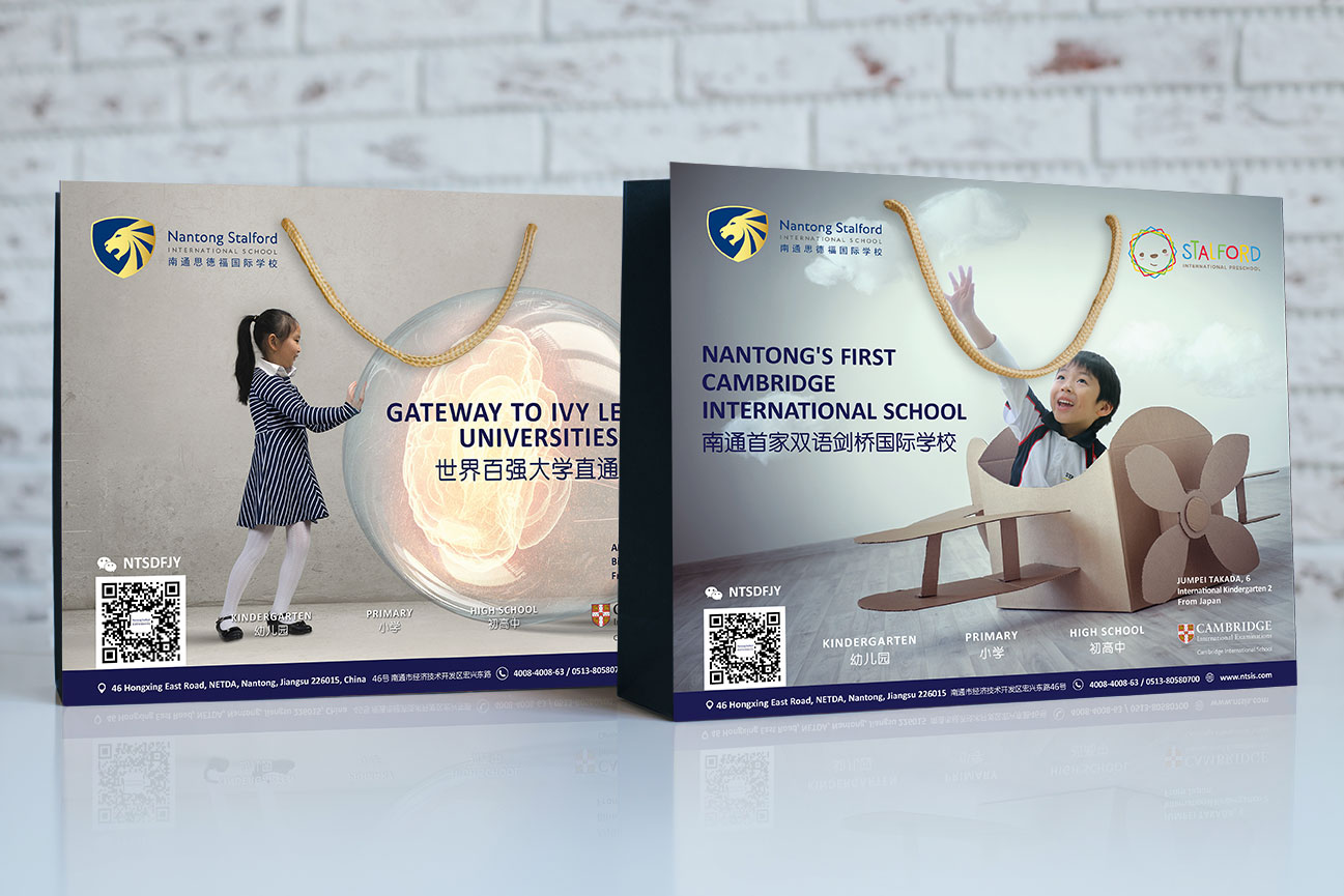
NTSIS Paper Bag
Logo on NTSIS Winter Trench Coat (Uniform by school)
