Logo Design for Liverpool Dental Care
When Dr. Feng came to me for a logo for her new business, a dental clinic, she set up a few challenges for the project:
- The logo of her new business must have a tooth in it (ding, ding! que all alarm bells in my system as I really didn't like to produce cliche ideas) as she felt that it is a universal sign that every young and old can identify with, even from a distance.
- The logo must reflect something british in it as she graduated from the University of Liverpool
The solution always seems so obvious on hindsight, but it was a real challenge trying to come up with an intelligent solution, an insight that no one would have observed before and it shouldn't be forced. I always believe in clever solutions and they normally meant not using the easy way out by drawing an obvious graphic to represent the idea, but rather, using an insightful thought.
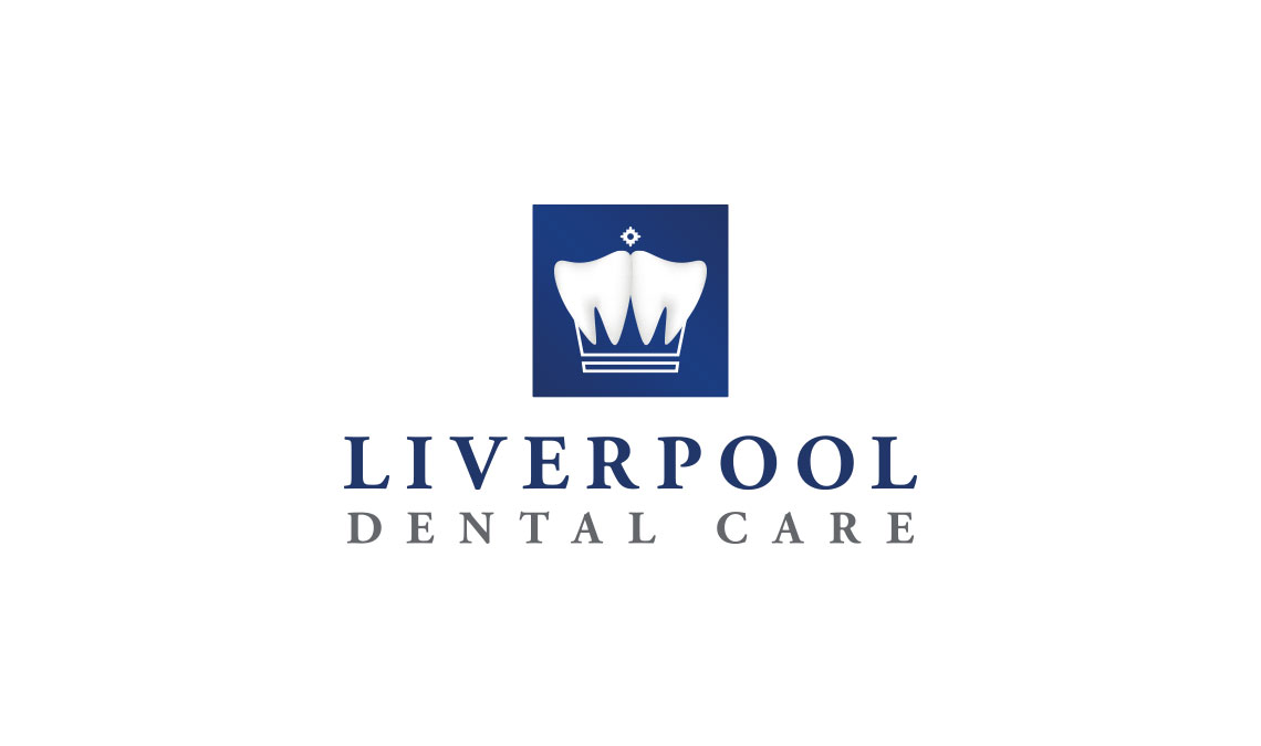
I felt that the British Monarch is something that will be of obvious association with the brits and discovered that we can form a crown with two teeth elegantly designed in it.
Like, who would have thought?


