Logo Design for Seed Floral
Sept 2016
When I was approached to design a logo for Seed Floral, the main message that the brand owner wanted me to convey is the concept of origins.
The logo is round in shape, representing the concept of a seed. But it is also inspired by dandelion.
Besides dandelion being a kind of flower itself, the concept also signifies my hope for brand operations to be a journey where it is enjoyable and feels light.
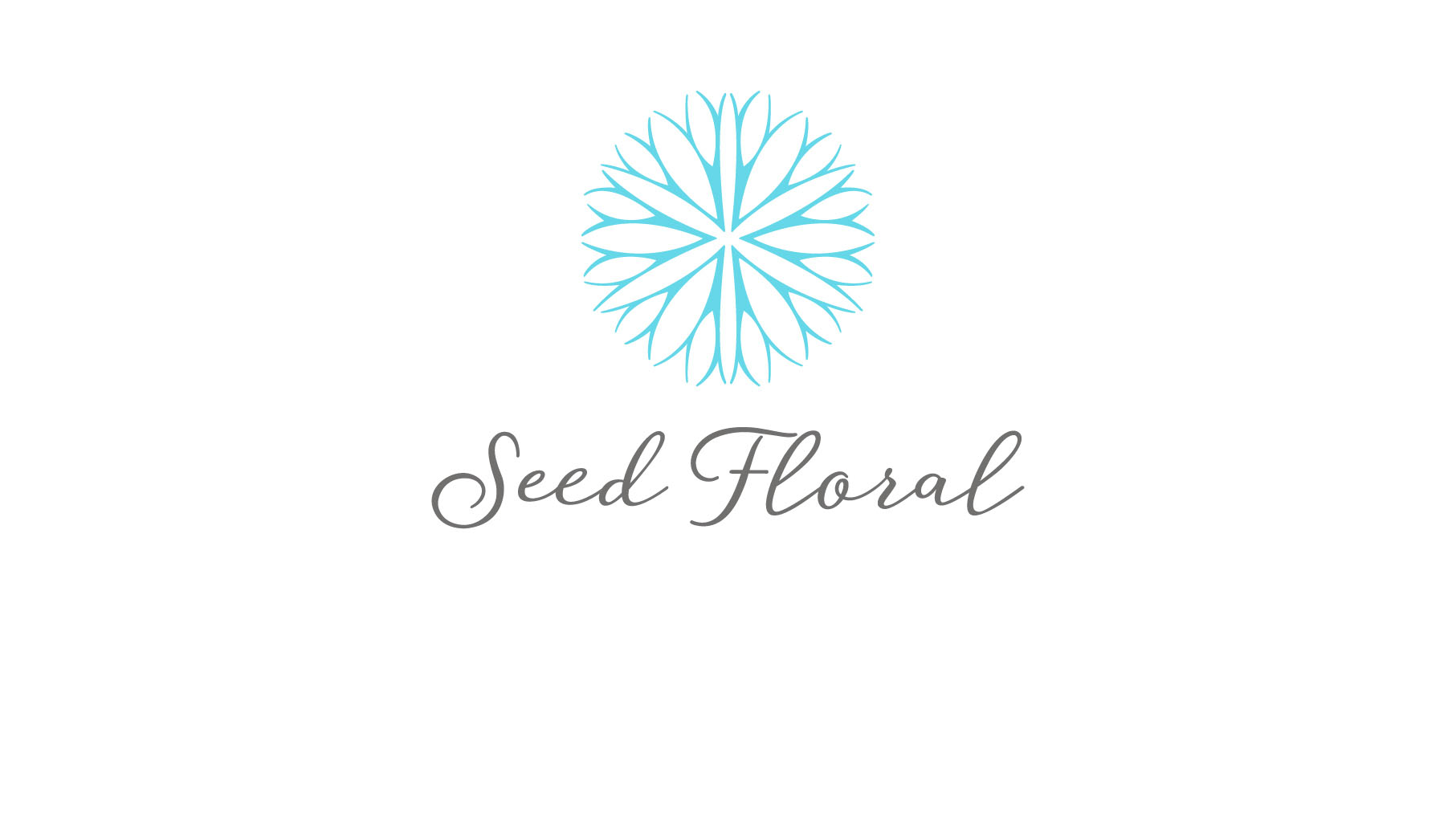
If one is to look at the logo carefully, there actually also represents three different types of flowers, meaning a variety of flowers to choose from at the florist.
Next, one will also notice that the veins are inspired from the look of roots; branching out from within. This concept represents the concept of originating.
At the same time, this conveys the expression of giving someone your best regards deep from within the heart, expanding outwards.