Logo Design for Kyoto Optics
When the brand owner of this optic brand came to me for a logo design, the brand name was actually only 'Kyoto Optics'. He had several criteria:
- The logo must exude a feeling of Japanese
- The logo must contain the colours primary red, yellow and blue.
Now it is not hard to imagine that any logo with the mentioned three colours risk looking tacky. I had to think of a way to present the brand in a chic and classy way and I did not want to go down the cliche path of drawing a pair of spectacles in an optical brand.
I wanted to design from an insightful thought, from a perspective that few would have thought of.
After thinking hard, I realised that Kyoto (a city in Japan), is actually called '京都' in Chinese. By playing a pun on '京', I came up with the concept of '睛都', with a big meaning behind it - 'City of Eyewear and Eye Care'.
The grand idea behind this concept also allows expansion into print communications like brochure and poster, just imagine stacking different kinds of eyewear to mimic the visual metaphor of buildings!
Signage
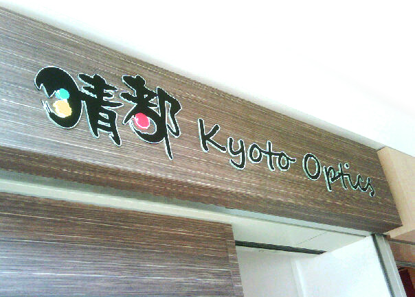
The brand owner liked the concept so much that he went to add '睛都' into the registered brand name. It was originally only 'Kyoto Optics'.
I also discovered that there is a coincidental number of three strokes that I could replace with three dots of primary red, yellow and blue. The logo is balanced with black so that it looks classy. The lone red dot in '都' represents Japan.